a cup, a country, a story
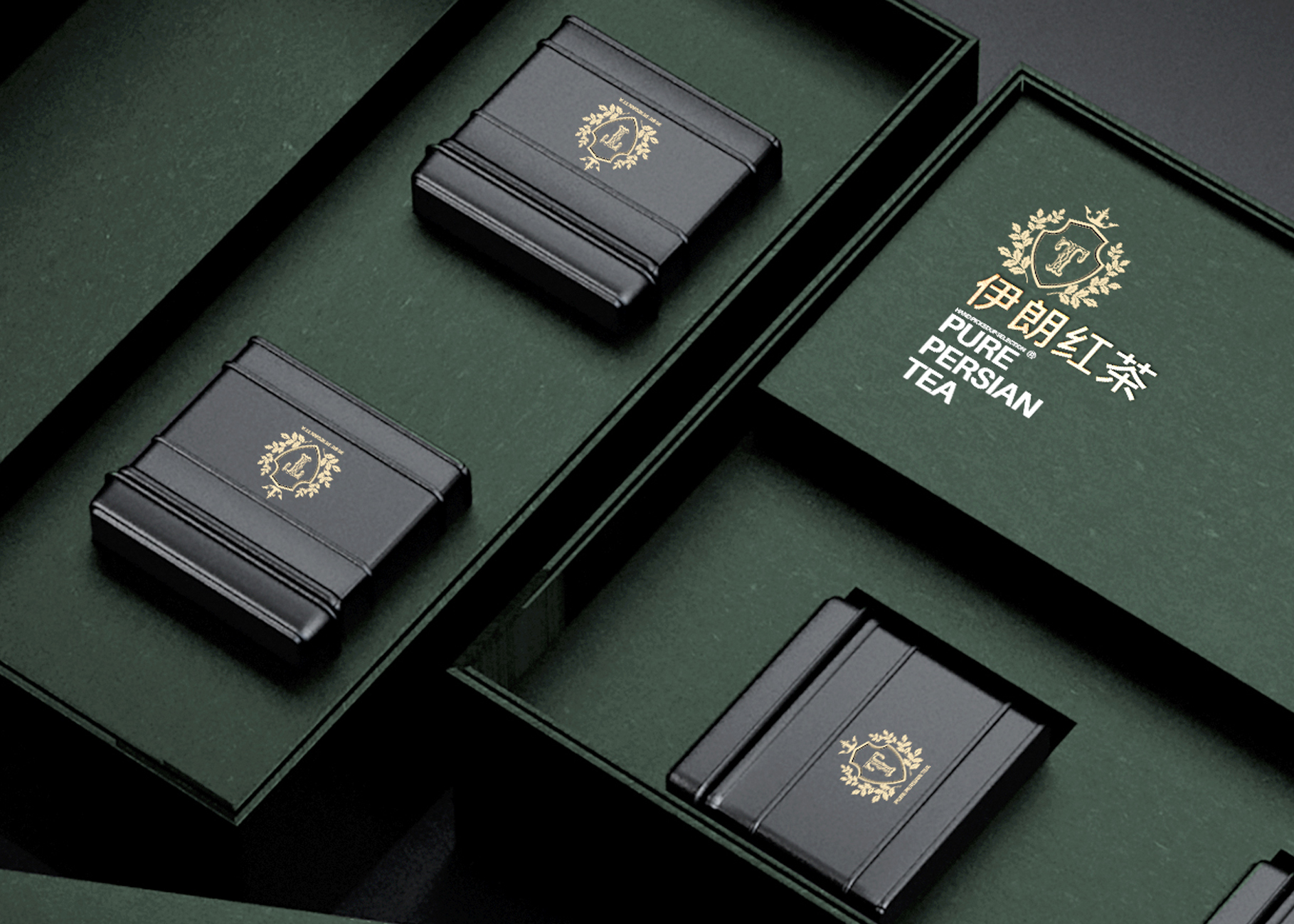
When a product can make you taste a place before you open it, the packaging has done its job. Persian Pure Tea is Taha Fakouri’s visual letter to Iran: a packaging concept that compresses landscape, craft and ritual into a tactile object on the shelf. The project put a familiar everyday product — loose-leaf tea — into a design frame that tells a compact cultural story and communicates quality at the moment of purchase.
Why this project matters — not just another tea box
Tea is iconic across Iran; it’s a social ritual, a domestic poetry and an economy. Designing its package requires respect for those layers. Fakouri’s Persian Pure Tea does three things at once: it signals provenance (this is Iranian tea), it protects the product (shelf life, light and moisture control), and it creates an emotional short-hand (a giftable object that carries cultural dignity). That intersection of function, storytelling and commercial viability is why the project is worth studying.
Designer mindset — anthropology first, then aesthetics
Fakouri’s approach begins with people and rituals, not with shapes. He looked at when and how Iranians drink tea — small bowls, steaming kettles, the choreography of pouring — and used those observations to set rules for the packaging: easy open, intuitive pouring, an option for gifting, and visual cues that read as authentic rather than generic “ethnic” decoration. The aesthetic emerges from those constraints: restrained geometry, considered color, and a single iconic motif that can scale from tiny sachets to a show-stopping gift tin.
Research & concept — mapping a visual language
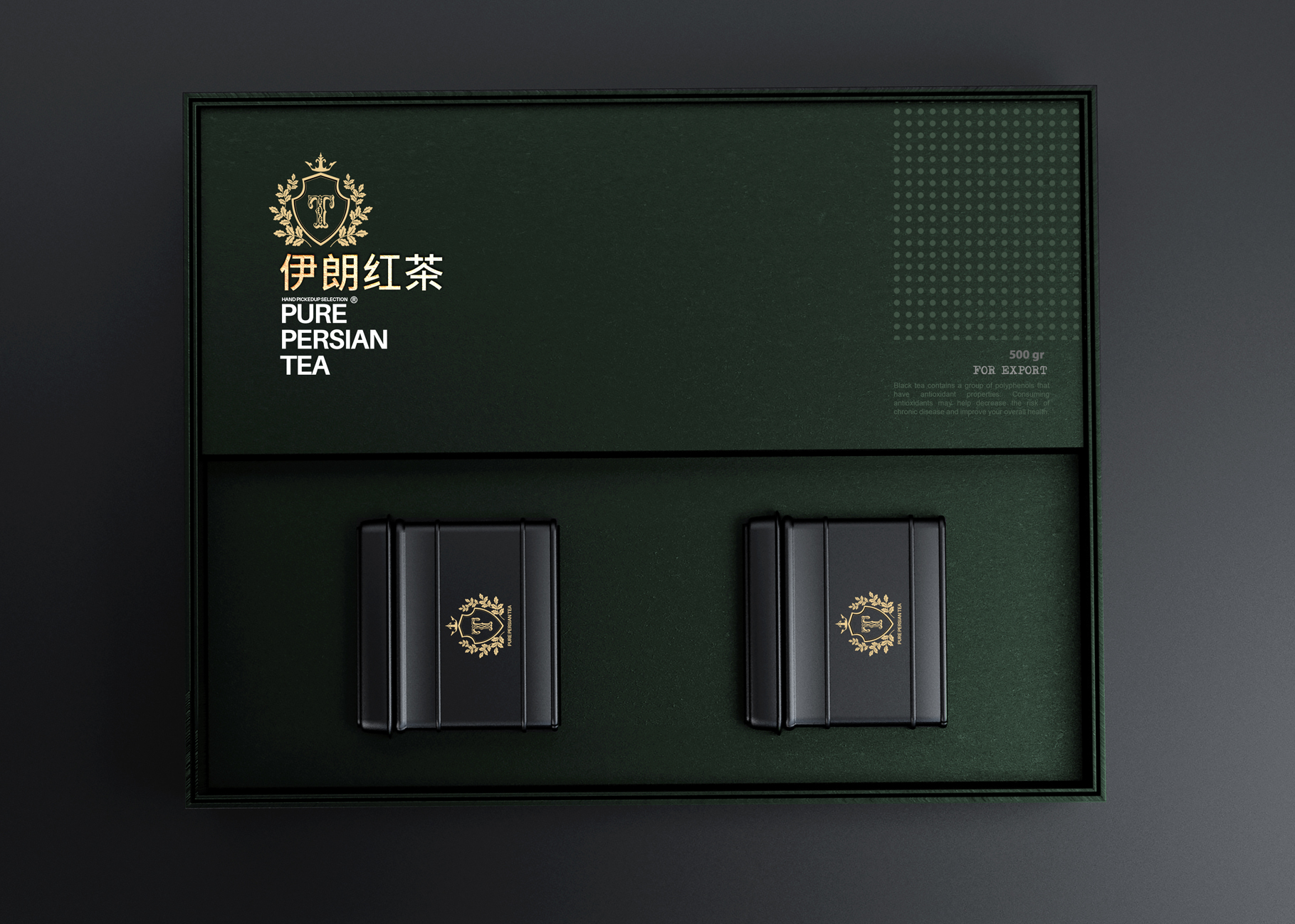
Every strong packaging project starts with constraints and references. Fakouri mapped local textile patterns, tea-growing regions, and traditional Persian lettering to create a visual vocabulary. He distilled motifs into glyphs that could be repeated as patterns or used as a bold seal. This research phase also defined technical constraints: what materials preserve aroma, how much headspace tea needs, printing tolerances, and which finishing techniques (emboss, foil, matte varnish) would read premium without blowing the unit cost.
Form exploration — modes that fit ritual
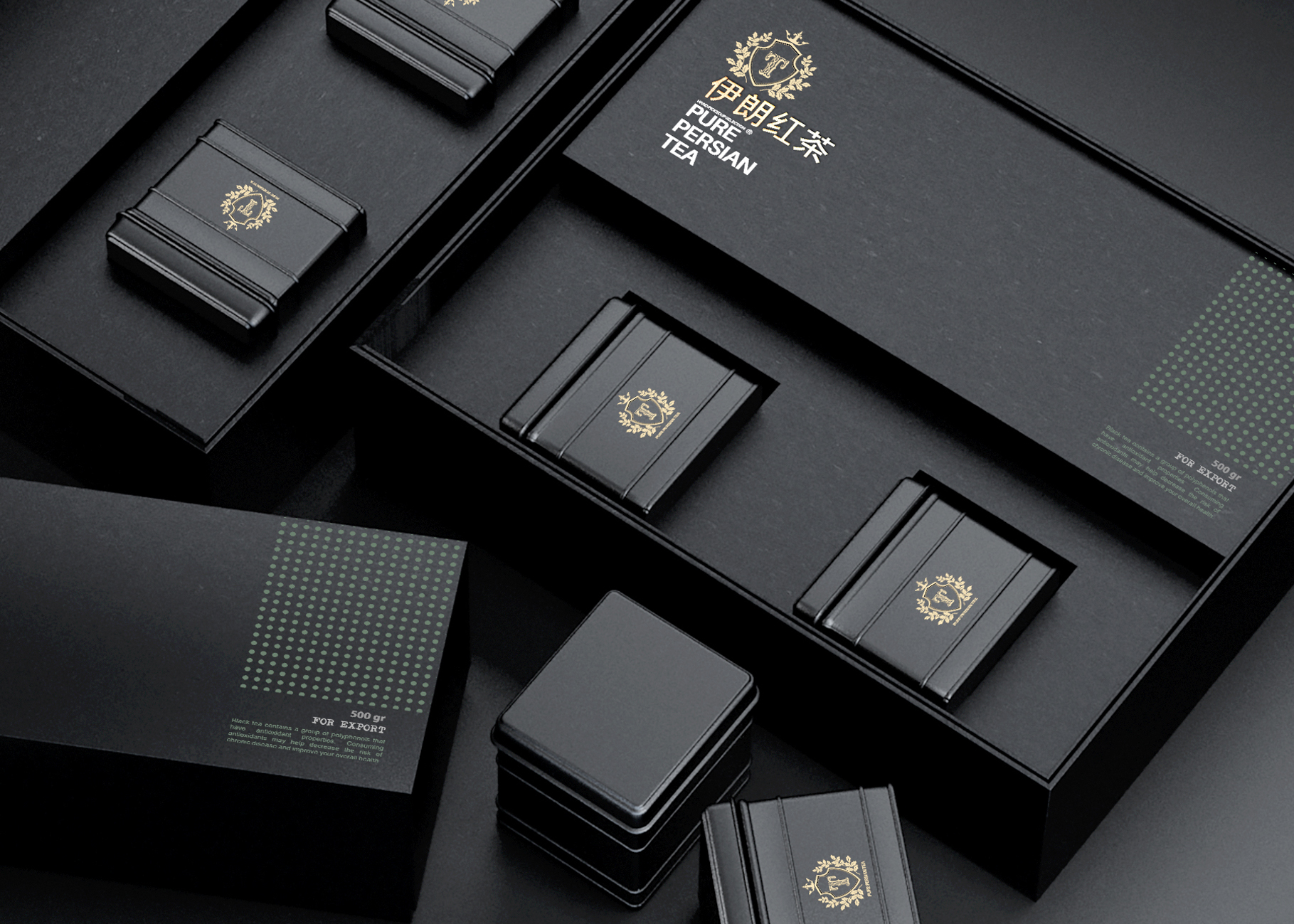
Fakouri tested several form families before settling on the final system: slim upright tins for retail shelving, small glass jars for premium lines, and compact gift boxes for specialty editions. The unified idea: a modular identity that behaves predictably across formats. Each format tested different interaction problems — a tin must allow easy scooping, a jar must show leaf quality, a sachet must be tear-friendly — and the final system balanced those affordances while keeping a consistent brand presence.
Material decisions — protecting flavour, signalling value
Tea packaging must do practical work: block light, control moisture ingress, and limit oxygen exposure. Fakouri specified inner aluminium laminates (or lined tins) for functional protection and outer layers (recyclable board, textured paper, or painted metal) for branding. Finishes were chosen with tactility in mind: soft-touch varnish for luxury lines, natural kraft textures for an origins range, and subtle foil for premium seals. The material palette communicates two signals simultaneously — the science of preservation and the poetry of place.
Prototyping & user testing — little rituals reveal big problems
Prototypes were more than pretty mock-ups. Fakouri used real tea in trial packs to check aroma retention, scooping ergonomics, and the visual experience of opening the package. He watched people brew: where did they pinch the packet, where did leaves spill, how did they pour? Small failures — a lid that stuck, a lip that spilled — were iterated away. Those field tests make the difference between an attractive object and a usable product people will return to.
Graphic system — balancing heritage and modern retail
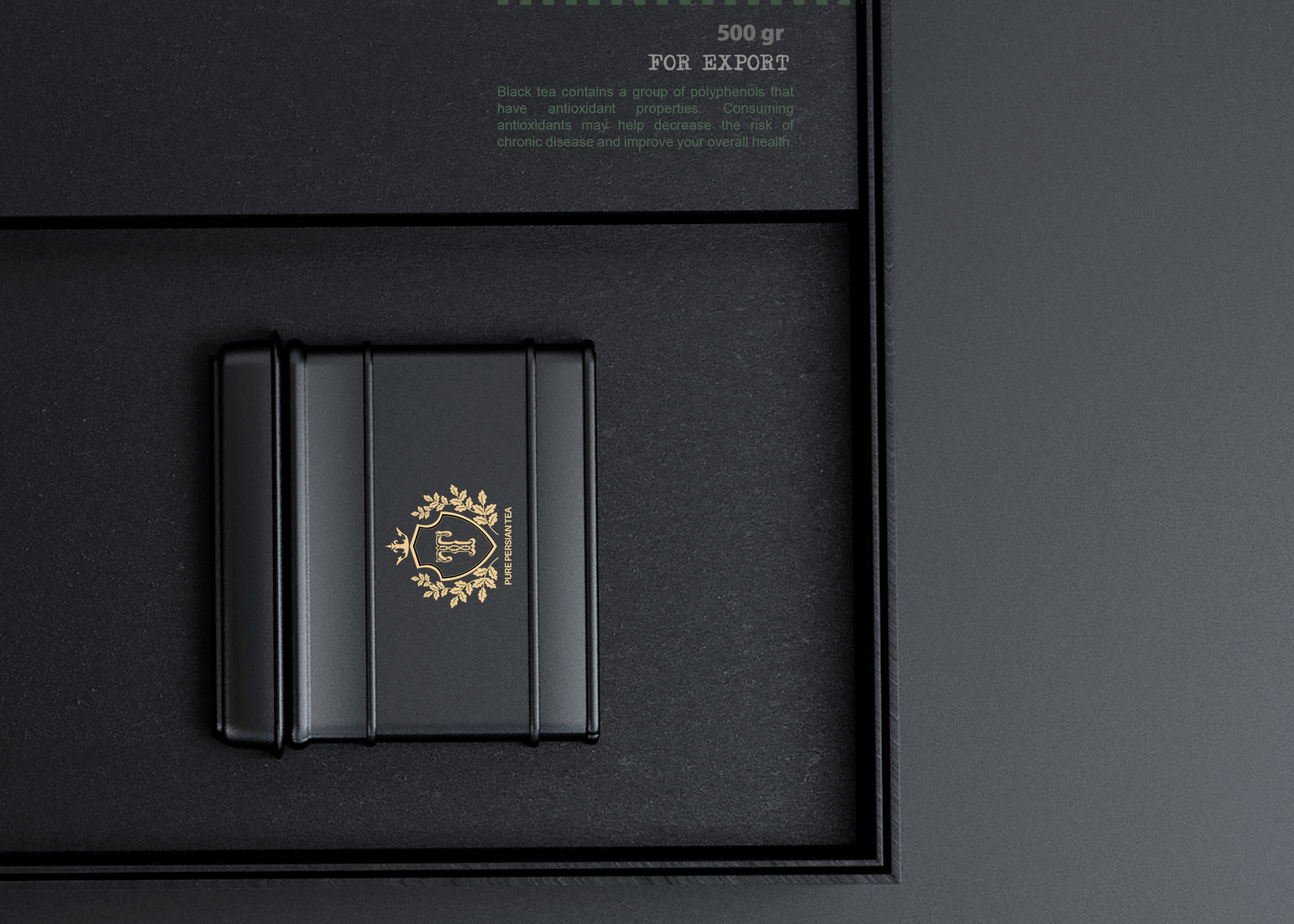
The graphic system walks a tightrope: it borrows from traditional Persian ornament yet reduces it to modern, repeatable shapes that work on mass-printed substrates. Fakouri used a single emblem as the brand’s centrepiece and supported it with restrained typography that hints at calligraphic lineage without sacrificing legibility. Color choices reference tea gardens (deep greens), sun-dried leaves (rich browns), and ceremonial golds for gift editions — a palette that signals both origin and premium intent.
Manufacturing & sustainability choices
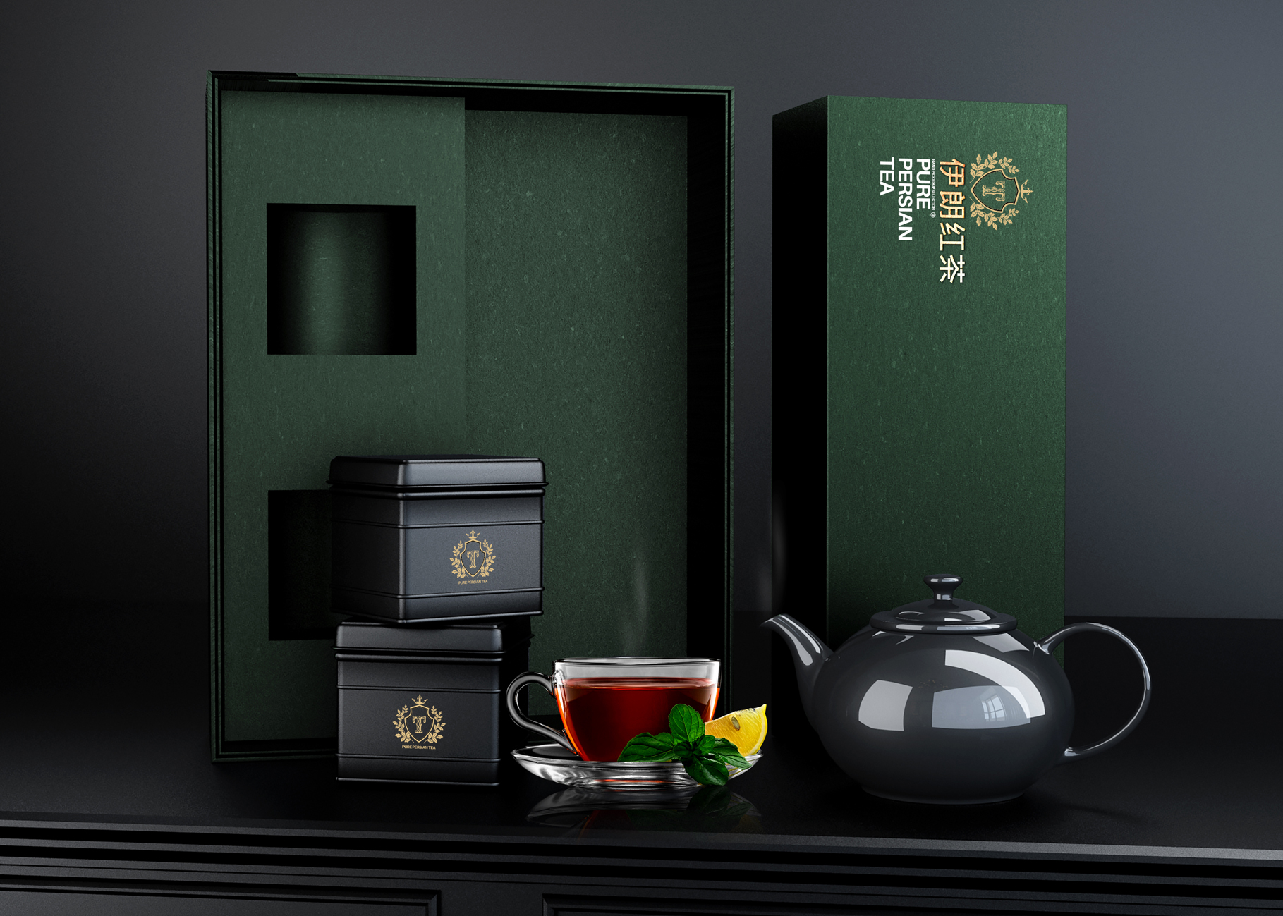
Scalability and environmental responsibility guided production decisions. Fakouri prioritized recyclable outer cartons, refillable inner tins, or reusable jars where possible to reduce single-use waste. When barrier liners were necessary, he selected the thinnest functional films and designed a refill program as a future option — a path that preserves aroma while reducing long-term packaging waste. These trade-offs show how cultural products can be designed with lifecycle thinking in mind.
World Brand Design Society
Brand positioning — gifting, heritage, and export potential
The project is positioned across three markets: domestic everyday consumption, premium gifting, and export to specialty retailers who want authentic provenance. The luxury tin acts as a souvenir and is ideal for diplomatic or corporate gifting; the minimal retail pack fits supermarket shelves; and the refillable jar appeals to boutique tea shops. This multi-tier strategy gives the design flexibility and improves commercial viability.
Design takeaways — lessons for students and studios
Design rituals, not products — observe the small human acts around a category.
Prototype with substance — test with the real product early (tea, in this case).
Make the protective layer beautiful — packaging must perform technically and emotionally.
Plan for scale and reuse — sustainability is both design constraint and market opportunity.
Keep the identity modular — one graphic system should work across tins, jars and sachets.
Final thoughts — a modern letter to an ancient ritual
Persian Pure Tea is a project that shows how packaging can be more than marketing: it can be a design gesture that respects ritual, protects craft, and opens a cultural conversation on the shelf. Taha Fakouri’s work reminds designers that the smallest everyday object — the tea packet — can carry heritage and act as an ambassador of place.
Official links for further reading:
https://www.behance.net/tahafakourffb0
https://worldbranddesign.com/taha-fakouri-creats-new-persian-pure-tea-packaging-design/
https://retaildesignblog.net/2020/08/26/persian-pure-honey-by-taha-fakouri/


